
Data.

Charts are brand assets — evidence rendered in house materials, following shop law. These rules came out of running a palette validator against the real tokens, not out of taste.

The seven laws

One chromatic color. The palette validator (dataviz six checks, cream-50 surface) passes exactly one brand hue for data marks: orange-500. Every other hue fails the chroma floor or CVD separation. Do not fight this; design single-series forms. One carve-out: diverging forms may use sage-600 as the second pole, because there the sign lives in position (law 3) and color is only reinforcement — legends for diverging charts must therefore be worded positionally, never by color name.
Reference, not rival. Before/after comparisons use a thin cream-600 reference bar and a thick orange-500 measure bar. Identity rides on thickness, position, legend, and direct labels — never on hue alone.
Diverging around zero. Polarity charts put sign in position (left/right of a wood-300 zero line). Sage-600 savings, orange-500/700 costs — color reinforces, position carries.
Pass/fail wears a glyph. Status marks are sage-600 ✓ and orange-700 ×, always glyph + color, never color alone. There is no red on this site.
Text wears ink. Chart values and labels use wood-800 (primary) or wood-500 (secondary). Series colors live in marks only.
Static SVG, tokens inline. Charts ship as hand-written SVGs in web/public/blog/, viewBox 720 wide, full data in the alt text. No chart libraries; react-markdown has no remark-gfm, so no pipe tables either.
Render and look. Every chart gets screenshotted (headless Chrome) and eyeballed before it ships. The validator checks color, not layout.

The form catalog

Pick the form by the data's job, then copy the matching exemplar. Every one below is a real rendered SVG from this repo, not an illustration of an idea.

job: A few headline numbers  ·  form: stat strip

Exemplar: stat strip

job: Magnitude, before vs after  ·  form: reference + measure bars
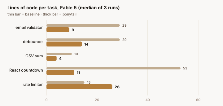
Exemplar: reference + measure bars

job: Before → after, lighter touch  ·  form: dumbbell
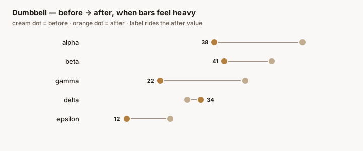
Exemplar: dumbbell

job: Change with a direction (polarity)  ·  form: diverging bars around zero
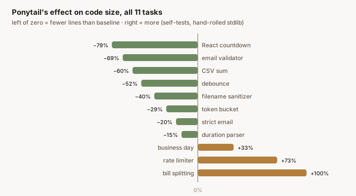
Exemplar: diverging bars around zero

job: One measure over time  ·  form: single orange line
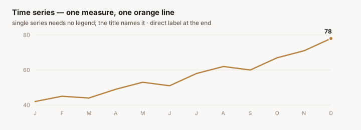
Exemplar: single orange line

job: Individual pass/fail cases  ·  form: glyph grid
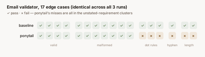
Exemplar: glyph grid

job: A large population of outcomes  ·  form: waffle
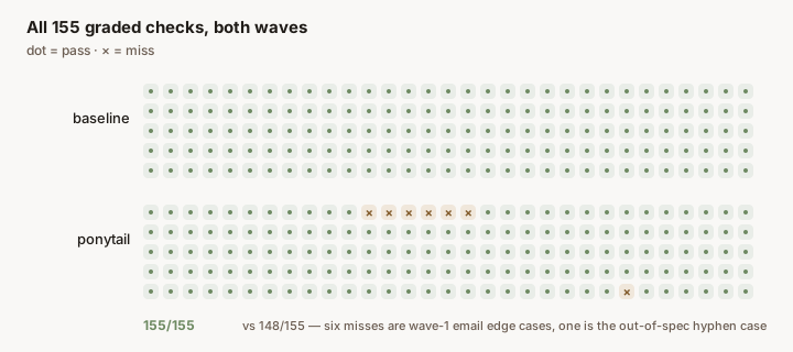
Exemplar: waffle

Do & don't

× don't — two brand hues as chart series

sage vs orange fails the validator: ΔE 4.6 under protan simulation. Colorblind readers see one series.

✓ do — reference bar + measure bar

Identity rides on thickness + position + labels. One chromatic hue is enough.

× don't — pipe tables in post markdown

| task | LOC | |---|---|

The blog renderer has no remark-gfm; this ships as literal pipe characters.

✓ do — chart it, or fence it

task LOC email 9

A house chart if the data has a story; an aligned ```text fence if it's a receipt.

× don't — text in series color

Revenue grew 34%

Series color on text reads as a link or a warning, and fails contrast on cream.

✓ do — ink text, color chip

Revenue grew 34%

wood-800 carries the words; a small mark beside them carries identity.